Pura Vida Packaging
Project Overview
I worked with the merchandising team and external print vendors to develop packaging for special launches, enhancing product presentation and encouraging repeat purchases. Through research and market trends, I designed compelling and thoughtful artwork, while working closely with the print vendors to approve color proofs, sizes, and quality.
Programs
Adobe Adobe Illustrator
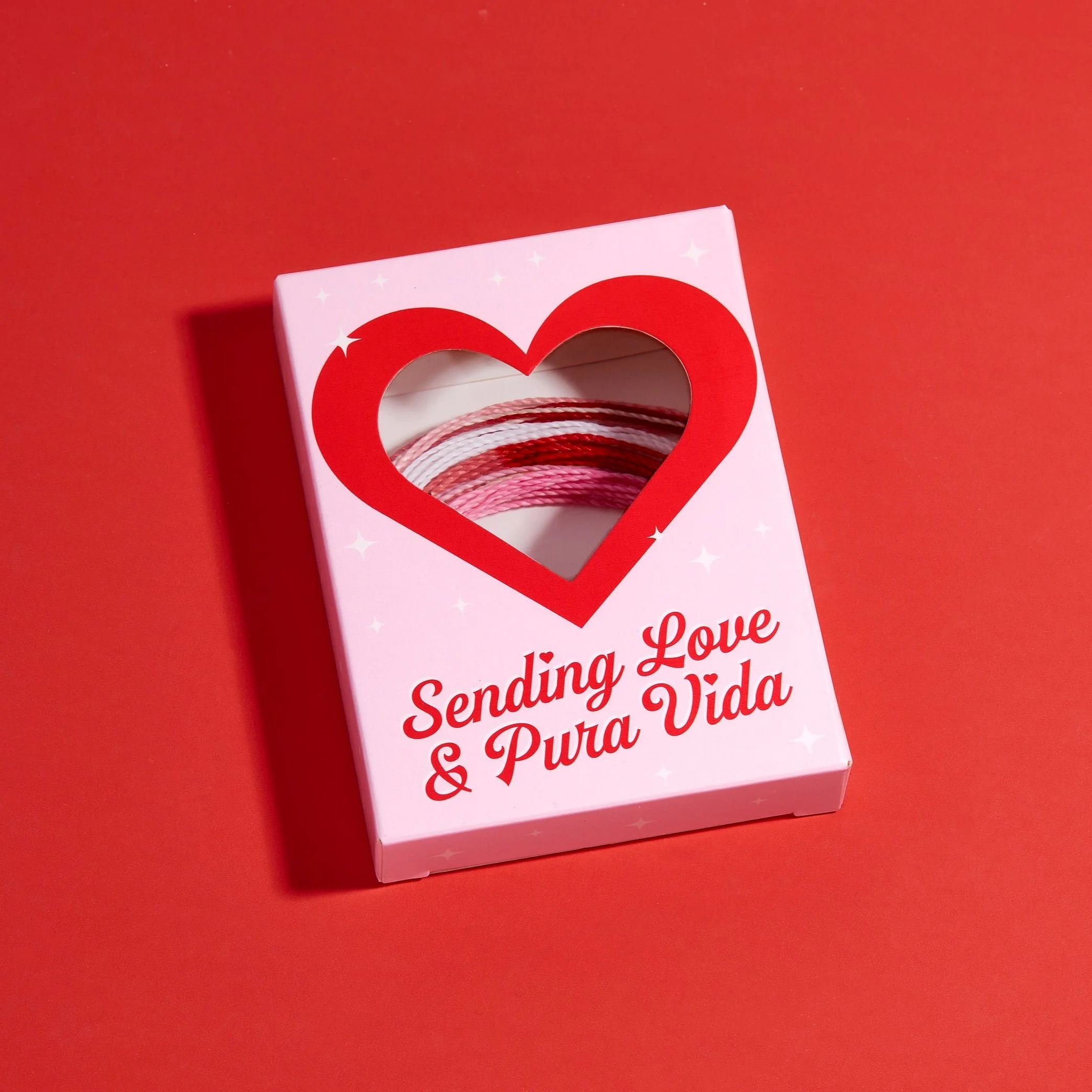
Valentine’s Day Box
Project Overview
I designed a Valentine’s Day Candy Box for The Hearts Edit Collection, which included a pack of five bracelets. It all started with an idea from the merchandising team to create a box resembling the classic Sweethearts candy box we all loved as kids. The challenge was: how do we achieve that with bracelets? We needed to make the bracelets visible without compromising the design.
I developed several die-line options, collaborating with the art director to test them using the Cricut. I explored a peek-a-boo option, where the bracelets showed through a window at the bottom, and even tried a more square version with a large, centered heart. Each iteration led to the final design below.


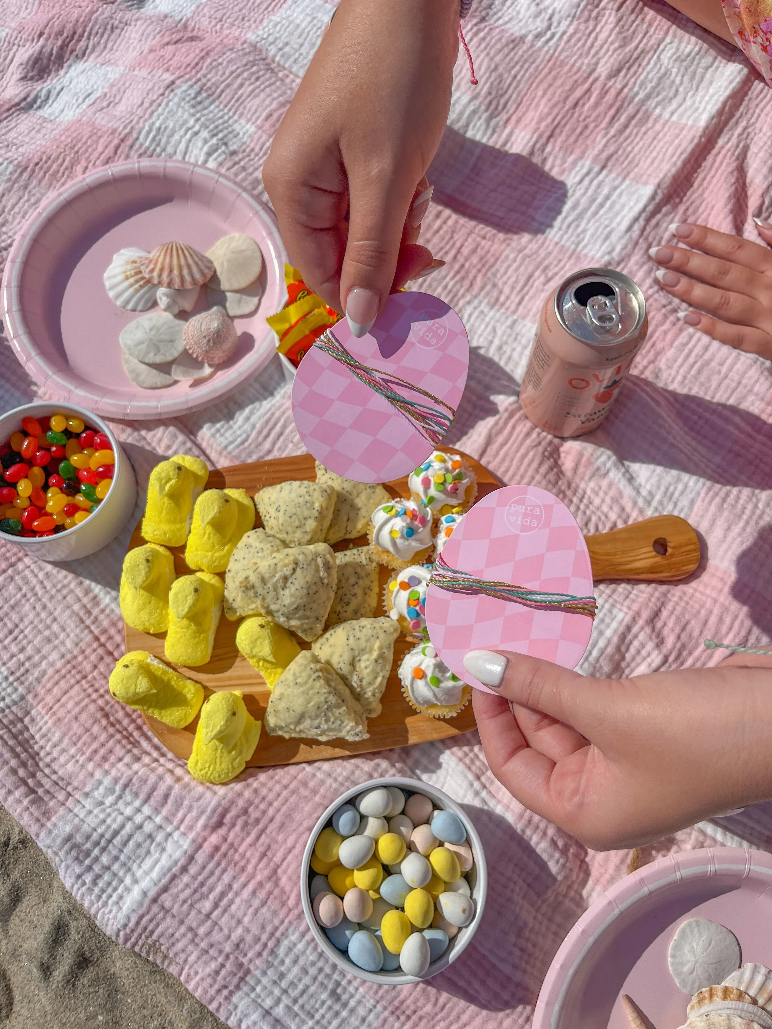
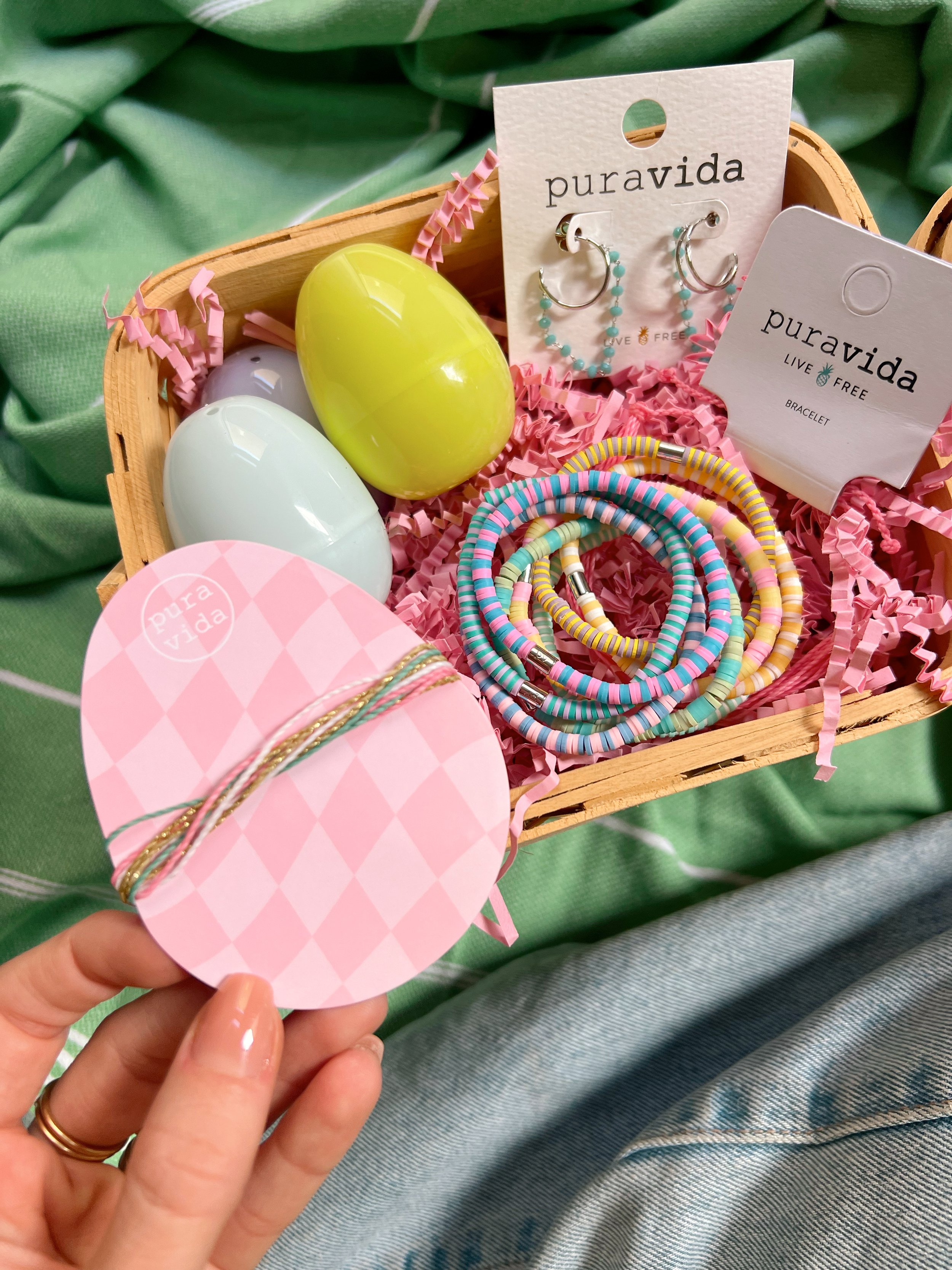
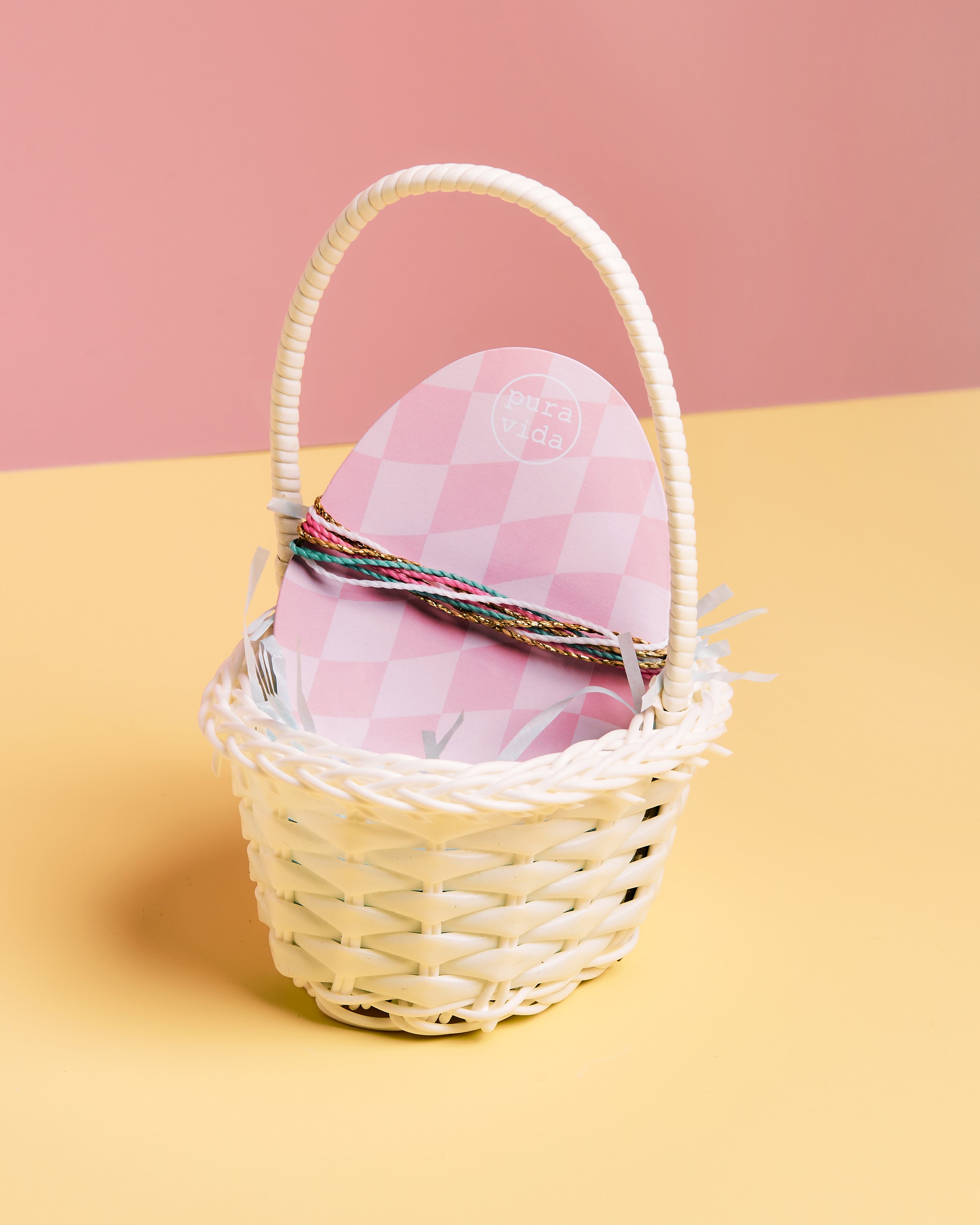
Easter Egg Card
Project Overview
The goal of this project was to create a card in the shape of an egg while keeping the bracelet sturdy and presentable. To achieve this, I added small, smooth notches to the sides of the egg and tested various shapes and sizes. For the design, I explored patterns and colors that would complement the plastic eggs we all see on Easter.


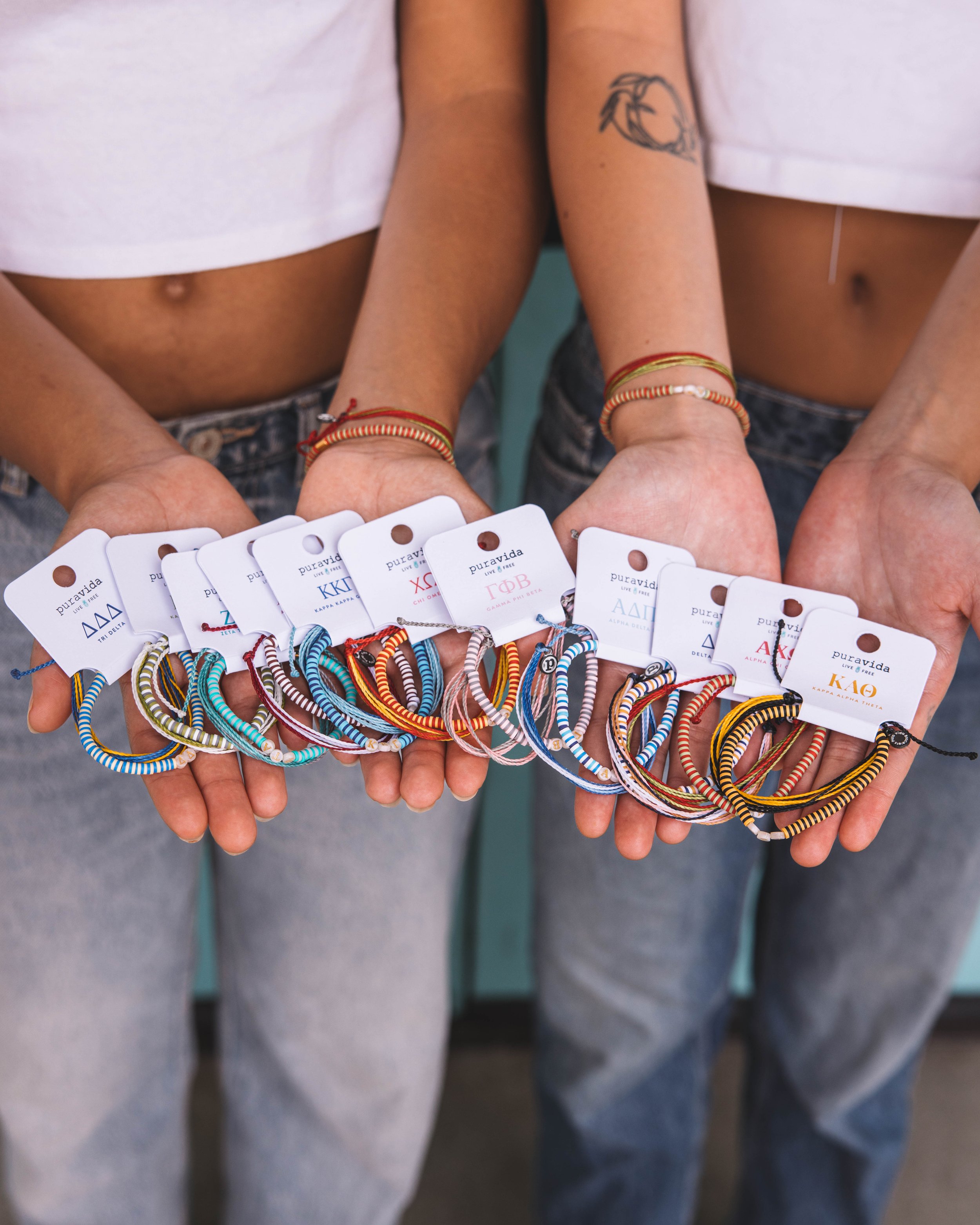
Sorority Tags
Project Overview
I was tasked with creating tags for our sorority bracelets. The challenge for this project was fitting the design onto such a small surface area. I explored options using just the sorority symbol and experimented with different colors and fonts. After careful consideration and side-by-side comparisons, the final design was created to ensure consistency and chapter recognition.
All the sororities provided me with their brand books, which required me to follow strict guidelines. The PMS color provided was Pantone Solid Coated; however, we had to print on uncoated paper. After carefully reviewing the coated and uncoated color books, I was able to translate the brand color to PMS Uncoated.


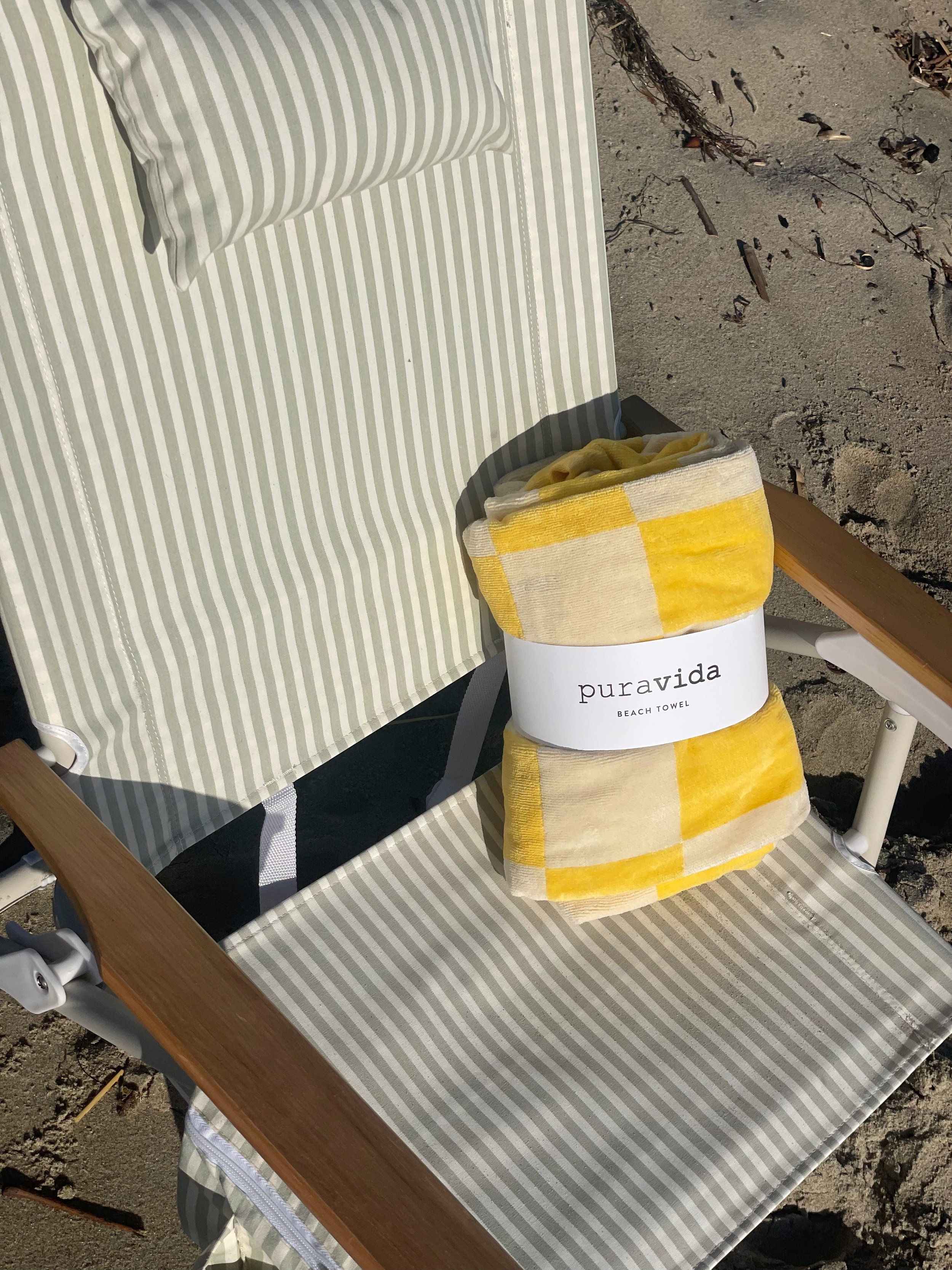
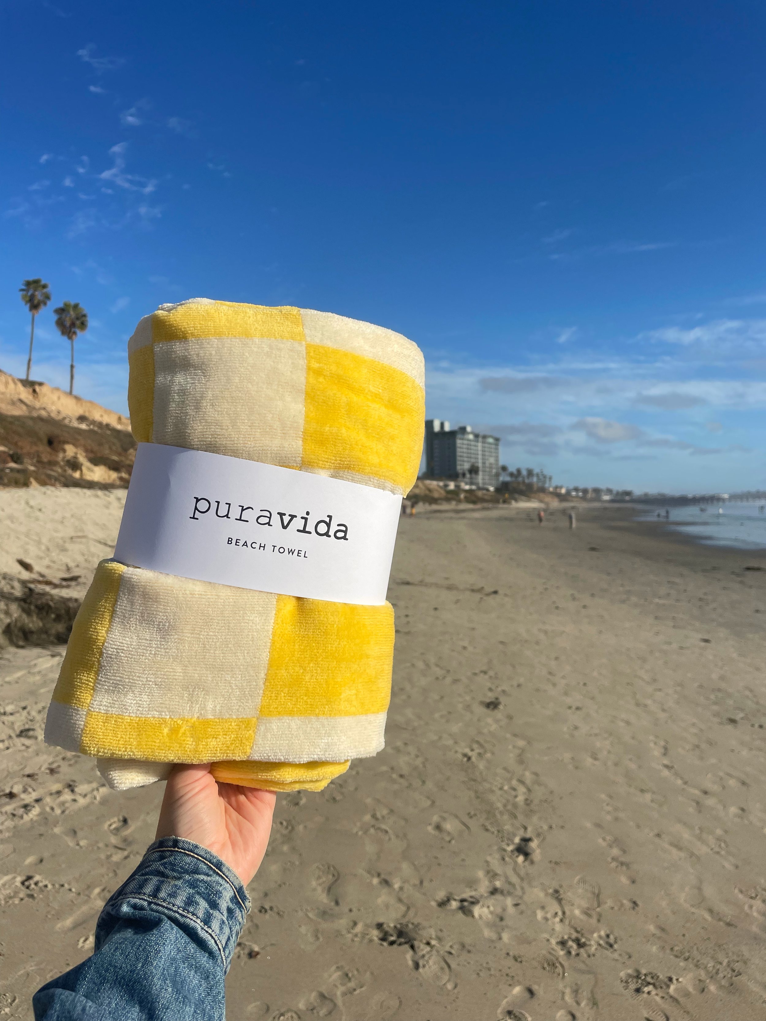
Beach Towel Wrap
Project Overview
The goal of this project was to design a simple yet effective packaging solution that securely held the towel in place. Inspired by jewelry tags, the design prominently featured the Pura Vida logo and product tagline on the front. A key challenge was determining the optimal wrap overlap on the back while keeping the UPC sticker and towel image centered. Once the ideal overlap was established, I arranged the product information vertically along the side.